
Responsive Website
ITHACA MISHPACHA (CHABAD OF CORNELL UNIVERSITY)
Role: Lead Designer
Goal: Create an online home for several series of lectures and recordings of a popular Ithaca, NY-based teacher. Lectures are meant to be listened to on-the-go, and range from over an hour to a few minutes in length.
Challenges: These recordings had been previously disseminated via Whatsapp group (later broadcast). There was an established and loyal audience which would expand, but no good way to find previously sent recordings, and no organization of the hundreds of existing recordings. The website had to be set up in a way that clearly and logically categorized the lectures, displayed them in order when necessary, with a focus on readability and ease of use. Ease of use extended also to the teacher himself, who required a very simple way of uploading and categorizing new recordings that he made.
Competitor Analysis
These applications are both used by a similar target audience. They provide lectures and recordings on Jewish topics for learning on-the-go. They are also categorized in a similar way, although with a different scope.
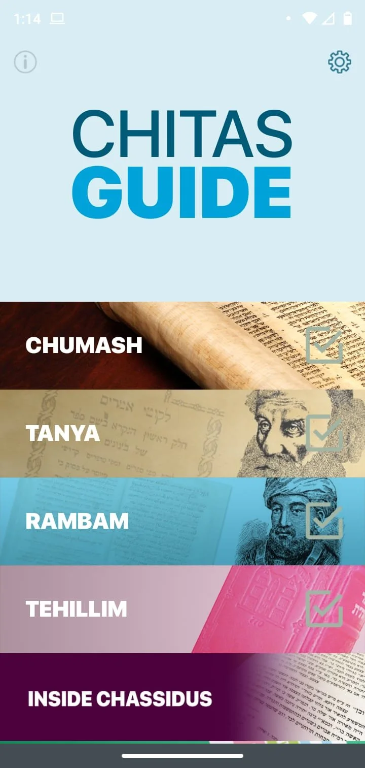
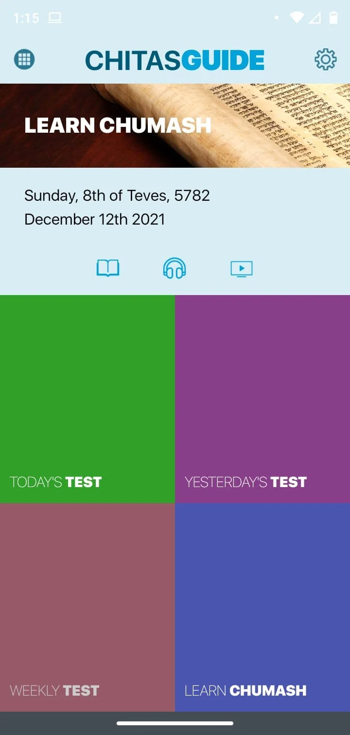
Chitas Guide App
Strengths: Simple layout, incorporates interactive elements (quizes, daily log)
Weaknesses: Can become overwhelming with lack of continuity (constantly adding new subjects), juvenile aesthetics, appears unoriginal as almost all elements act as portals to an already existing website, app itself does not have its own desktop version
Inside Chassidus
Strengths: Desktop and mobile app, very comprehensive,
Weaknesses: Busy aesthetics, some unnecessary elements on homepage, too much text which could be streamlined with images or icons

Target User (survey results)
Jewish, millennial, works or studies full time. Has a busy career and/or young family. Our target user has little free time, but would like to add inspiration or Jewish knowledge to their day. User has a basic foundation of Torah knowledge but would like to know more. He/She would like to feel like part of a community. Likely times for using the app are driving, working on other tasks, taking care of small children, or running errands. The user would like “bite-size” pieces of information that can be easily shared with friends and family.
UI Design
Layout: The backend format of this site is a Squarespace blog. This allows the owner to easily enter a new blog post whenever he had a recording to upload, and tag the post accordingly. Each page of the site is a summary block of a tag or category that the owner assigns to the post. The pages populate as new posts are uploaded. Pages which require the posts to appear in a specific order are populated manually.
Components: This site was designed using the Squarespace platform, whose templates don’t allow for the design that I was going for. Squarespace’s default buttons are too big, too widely spaced out, and too bulky to accommodate for the number of links that I needed. I needed to use several CSS customizations to achieve the look that I wanted.
Aesthetics: The numerous links are set against calming backgrounds, to avoid distracting from the content.
Next Time…
Budget and time constraints limited design options on this project, but if I could tackle it again, I would:
Incorporate a mobile app in addition to the website
Provide in-app suggestions for similar posts once the user finishes one
Allow the user to filter recordings by duration, to better accommodate users on-the-go
Allow pieces of source text to accompany the recordings, with highlighting or small animations to aid in understanding
Add a counter function to each post to show how many have listened.